


The chart below shows the percentage of volunteers by organizations in 2008 and 2014. Summarize the information by selecting and reporting the main features, and make comparisons where relevant. Write at least 150 words.
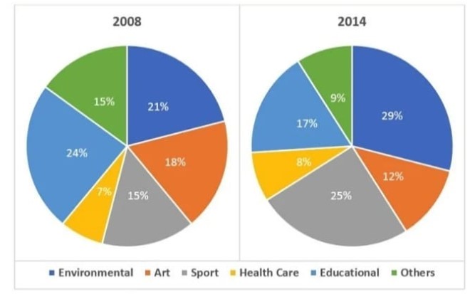

The yielded two pie charts demonstrate organizations wise how many people did voluntary work in 2008 and 2014.
Overall, in starting year For the environment field, volunteer proportion was on top while for health at least after six years for people who did free works proportion was high in environmental organizations and the lowest was same as before.
In 2008, with the highest percentage, for education organizations, volunteers had roughly a quarter proportion. 18% of volunteers went to the art realm. Others and sports had the same percentage of people who did unpaid works on account of 15%. Moreover, health care organizations had only 7% volunteers, although education had a triple proportion than health care.
After one year and half a decade later, work for Health care proportion was nearly same as in 2008. people who did voluntary work percentage decline 6% in arts and other organizations A quarter proportion of volunteers joined with sports field whereas, environment and education had 29% and 17% respectively.
Follow Us on IELTSFever Facebook
Also, Read Some People Claim That the Government Should Provide Free Health Care