


The charts below show household spending patterns in two countries between 1980 and 2008. Summarize the information by selecting and reporting the main features, and make comparisons where relevant.

Sample Answer of The Charts Below Show Household Spending Patterns in Two Countries Between 1980 and 2008
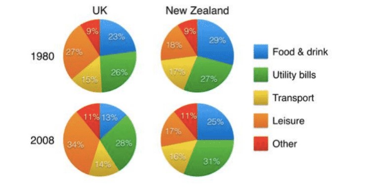
Pie charts illustrate the data of household expenses pattern for the country the UK and New Zealand for the year 1980 to 2008.
In the year 1980, the population of the UK spent nearly a quarter on both Utility bills and Leisure activities (26% and 27% respectively). However, New Zealand spent only 18% on Leisure but 27% on bills. Although on the expense on transport and food and beverage are UK (15% and 23%) and New Zealand (17% and 29%) respectively. Lastly, both countries spent 9% each on others.
Later in the year 2008, UK people spent the maximum on Leisure (34%); however, the population of New Zealand spent majorly on utility bills(31%). Although they still spend equally on others and not even much difference from previous years and now its 11% each. UK population cut down their food and drink expenses and reached to 13% only, and new Zealand also cut by 4% and reached to 25%. And there was not much difference in transportation expenses for the UK and New Zealand (14% and 16% respectively). Lastly, the UK spends 28% on bills and 17% by New Zealand on Leisure.
Overall, over the span of 28 years, the UK population increased their expenses on Leisure. However, New Zealand spends more on bills.
Follow Us on IELTSFever Facebook