


The Graph Below Gives Information About International Migration to The Uk, 1999-2008. Write a Report for A University Lecturer Describing the Information Shown Below. Make Comparisons Where Relevant.
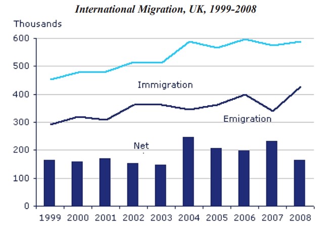

Overall, the number of immigrants to the UK was the highest over the given period compared to emigration, with the most migration noted in the final years.
Moving into the details, it’s crystal clear that around 450 thousand immigrants were accounted for in 1999, which is 60 thousand more than emigration in the same year. In 2001, a gap of 150 thousand was noted between immigration and emigration. Individual immigration reached around 600 thousand in 2008, while emigration only crossed 430 thousand at the end of 2008.
Looking at the rest of the details, the number of net migrations was around 170 thousand in 1999. It fluctuated over the next five years and touched around 250 thousand in 2004, which was the highest migration since 1999. A similar number of migrations was recorded in 2005 and 2006, accounting for 200 thousand. In the final year, the migration reached 170 thousand.
Follow Us on the IELTSFever Facebook Page For More Updates