


The Graph Below Shows the Number of Inquiries Received by The Tourist Information Office in One City Over a Six-Month Period in 2011. Summarize the Information by Selecting and Reporting the Main Features and Making Comparisons Where Relevant.
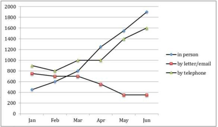

To begin with, as can be seen from the graph, there have been various fluctuations over the last six months. In January, inquiries made by telephone were at a zenith, between 800 and 1000, which was higher than those made in person or by letter. However, by the end of the period, inquiries received in person surpassed those made by telephone by almost 100. In March, 1000 inquiries were received by telephone, which remained steady until April. The number of inquiries then rose and peaked at 1600 by June.
On the other hand, the number of inquiries received by letter/email remained steady from February to March and May to June. In January, the number of inquiries by letter was nearly 800, which decreased slightly to around 700 in March. By June, the number of inquiries by letter/email was at its lowest point of 400.
However, inquiries received in person at the tourist information office were initially at a rock bottom 400. However, they reached a summit of 1900 in June, higher than the others.