


The Charts Show Information About the Number of Kilometres Travelled in An Average Month and The Distribution of Vehicle Types in Britain. Summarise the Information by Selecting and Reporting the Main Features and Making Comparisons Where Relevant.

The graphs provided illustrate the monthly travelled kilometres along with the purposes behind them, and the pie charts compare five types of vehicles in two different years, 1990 and 2000.
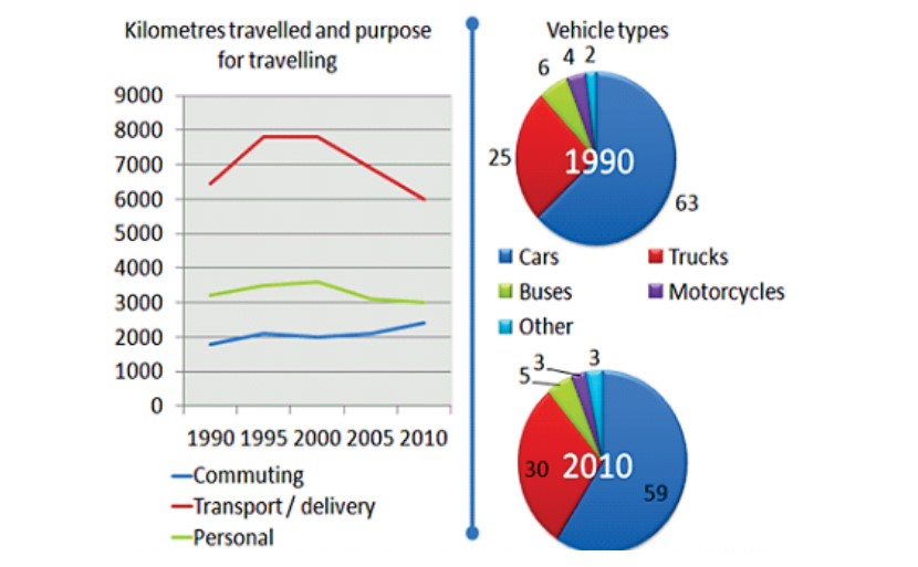
Overall, it can be seen from the graphs that the highest kilometres were travelled for delivery and the lowest for commuting. In both years, the car was the most preferred vehicle type.
A glance at the data demonstrates that most of the kilometres were travelled for delivery, whereas the least was for commuting. In 1990, the travelled kilometres were nearly 7000 for transport and 2000 for commuting. Moving further, the distance travelled rose with time for both until 1995, after which kilometres for delivery fell. However, travelling increased for commuting over time. Likewise, around 3100 kilometres were travelled for personal reasons in 1990, which showed an incline until 2000, after which it started declining.
Further analysis of the data depicts that the car was the most common type of vehicle in both 1990 and 2010, accounting for 63 and 59 per cent, respectively. In 1990, trucks accounted for about 25 percent, which increased to 30 percent in 2010. Probing further, buses were 6 percent in 1990, which decreased in 2010. Other vehicle types were 2 per cent in 1990 and declined to 1 per cent in 2010. The percentage of motorcycles also declined in 2010 from 4 percent to 3 percent.
Follow Us on the IELTSFever Facebook Page For More Updates