The charts show the distribution of money spent on music in three different years in Northern Ireland. Summarise the Information by Selecting and Reporting the Main Features and Making Comparisons Where Relevant.
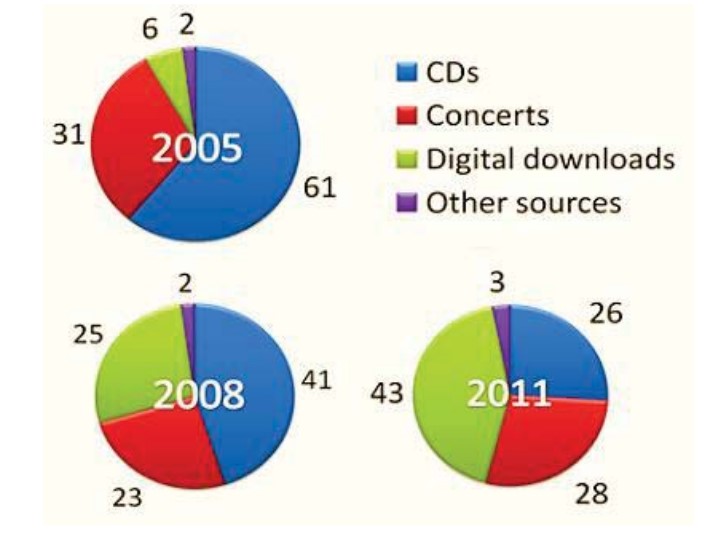 The pie charts compare the differences regarding allocations of money to music in Northern Ireland in 2005, 2008, and 2011.
Overall, it is clear from the illustrations that in the beginning year, most of the money was spent on CDs. However, this trend fell in the following years.
At a fleeting glance, it is noticeable that in the initial year, a lesser amount of the budget was spent on digital downloads and other sources, with total spending of 6% and 2%, respectively. However, the cost of CDs was double the amount spent on concerts. In 2008, the allowance for other sources remained equal to the past, but in the case of digital downloads, individuals preferred one-fourth of the amount.
Regarding 2011, in Northern Ireland, the demand for digital downloads inclined steadily, comprising 43% in value. However, the distribution of money on CDs and concerts was almost equal in 2011. On the other hand, a slight difference can be seen in the preference for other sources.
Follow Us on the IELTSFever Facebook Page For More Updates and Latest News By IDP