The Pie Charts Below Give Data on The Spending and Consumption of Resources by World Countries and How the Population Is Distributed. Summarize the Information by Selecting and Reporting the Main Features, and Making Comparisons Where Relevant.
 The pie charts below give data on the spending and consumption of resources by countries worldwide and on the distribution of the population. Summarize the information by selecting and reporting the main features and making comparisons where relevant.
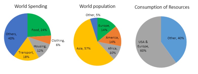
The pie charts provide information about how people spend money on daily needs or resources, consume resources worldwide, and divide the population globally. Asians populate a significant portion of the world, while the USA and Europe use most of the world’s resources.
The first pie chart defines world spending on resources. The most valuable item is food, on which people spend 24%, and 6% on clothing. However, people spend 18% on transportation, 12% on housing, and 40% on other items.
The second pie chart shows the world’s population. As mentioned earlier, 57% of the population is in Asia, 14% in America and Europe, 10% in Africa, and 5% in other regions.
The third pie chart illustrates the consumption of resources divided by the world’s population. The USA and Europe, comprising 28% of the population, consume 60% of resources, while the remaining population consumes 40% of resources.