The pie charts compare ways of accessing the news in Canada and Australia. Summarise the information by selecting and reporting the main features, and make comparisons where relevant. Write at least 150 words.
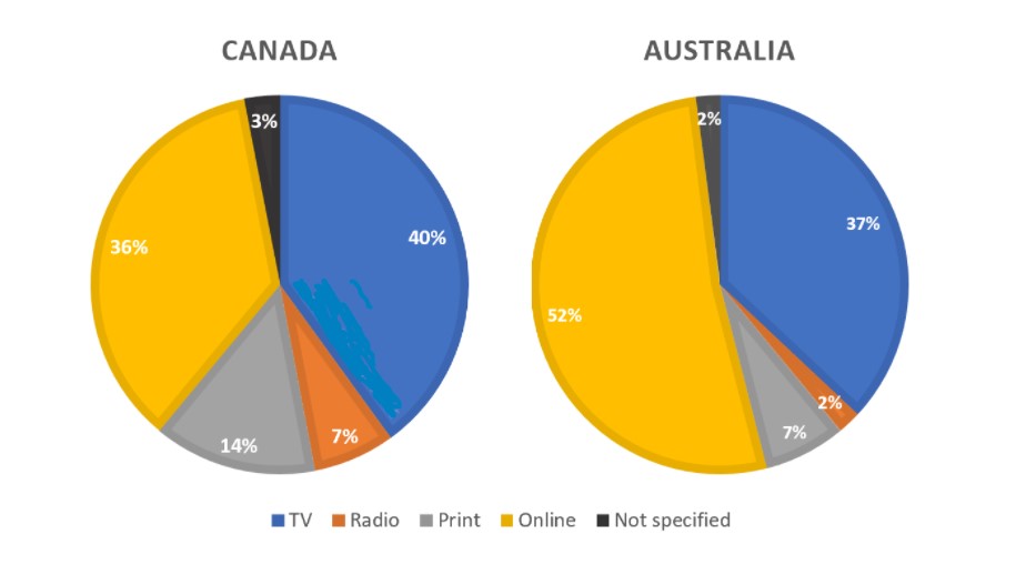
The pie charts compare the four different ways from which Canada and Australia access news. These sources include Television, Radio, Print, and Online.
Overall, news from TV and online acquired the highest position, while Radio at the least among the given sources.
To begin with, Canadian people accessing news from television is 40% which is almost equal to the percentage in Australia with just 3% less. Just above half of the Australians are accessing the news through online mode, while 36% of Canadian people are getting it from the internet.
Moreover, print media and radio were among the least popular modes of getting news across Canada and Australia. The percentage of people accessing news from print in Canada stood at 14%, which is exactly double the figure of Australians. Canada has 7% of news access through radio, while only 2% in Australia. Additionally, the source is not specified among 2 to 3% of people in both countries.
Follow Us on IELTSFever Facebook
Also Read Some People Claim That the Government Should Provide Free Health Care
great writing sir