The chart below shows the percentage of young people in higher education in four different countries in 2000, 2005 and 2010. summarise the information by selecting and reporting the main features and make comparisons where relevant.
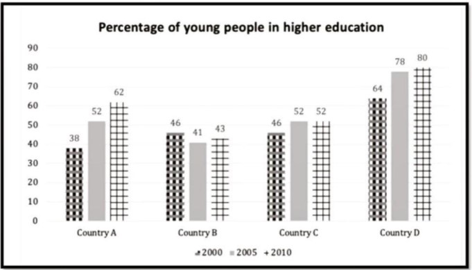
The bar chart gives a statistical comparison of young people attending tertiary institutions in four nations in three different years.
Overall, country D had the highest proportions of young people enrolled in University among the four countries over three years whilst Country B was the only nation to witness a drop in attendance in 2005, it also documented the lowest percentages over the three given years. Country A and C both witnessed a rise in University attendance though A enrollment was higher between the two.
In 2000, Country D experienced a slight increase up from 60%, reaching 65% in 2005 and then a marked surge over five years of 15% to end at 80% in 2010. However, Country B, which had the lowest proportion of University enrollment among the young population, witnessed a slight drop in 2005 of around 2% from 40% in 2000, and a minor uptick in 2005 to end at 40% again in 2010.
Turning to Country A and C, tertiary education attendance for both nations rose from 37% and 50% in 2000 to 48% and 52% respectively. A significant surge was documented for Country A, which ended at around 58%, up from 48%, though Country C remained at a constant rate of 40% in 2010.
Follow Us on IELTSFever Facebook
Also Read Some People Think That Climate Change Could Have a Negative Effect on Business