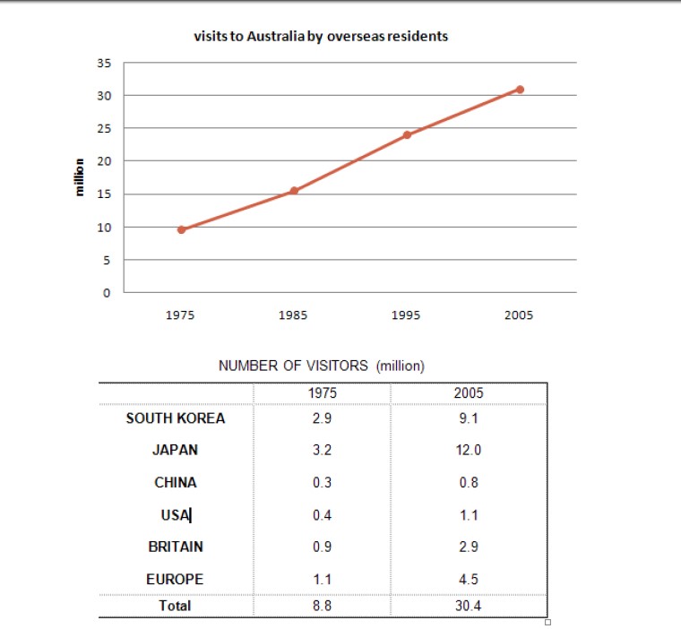
The line graph below shows the number of annual visits to Australia by overseas residents. The table below gives information on the country of origin where the visitors came from. Write a report for a university lecturer describing the information given.
This line graph illustrates the information about the total number of people who visit Australia yearly in a million and the table shows the people who belong to different countries.
Overall, Initially, there were fewer dwellers travelling to the country Australia when compared to the next consecutive years, and also more inhabitants are from the country japan and least are from the country china.
In the year 1975, there were about 10 million people who came to Australia, and in the next ten years, the count increased largely to approximately 15 million. Also, almost 3.2 billion people are from Japan and South Korea, which is 3.2 and 2.9 respectively, and the least number of visitors are from China and the USA that is 0.3 and 0.4 million. Britain and Europe country total number of visitors were almost nearer to each other which is 0.9 and 1.1 million.
Furthermore, In the year 2005, the number of visitors rocketed nearly 30 million, and on the other hand, more tourists from the country Japan were 12 million and in the next place South Korea with 9.1 billion. The countries China, the USA, Britain and Europe inhabitants visiting count is almost nearer to each other with a one million difference approximately which are 0.8,1.1,2.9,4.5 million.
Follow Us on IELTSFever Facebook
