The pie charts below give data on the spending and consumption of resources by countries of the world and how the population is distributed. Write a report for a university lecturer describing the information shown below.
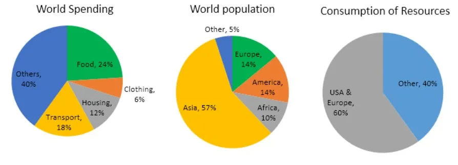
The provided three pie charts depicts the information on the resources spent and consumed by countries in every nook and corner. Besides, the population in the entire world is also provided in one of the pie charts. Moreover, the pie charts are categorized as World spending, World population, and consumption of resources.
Overall, it is evident that the masses are spending most of the penny on food and on others, whilst the least spent on clothing. On the other hand, the largest population is in Asia and the resources consumed more by the USA and Europe.
From the first pie chart, the amount spent on food is just below the quarter, and the penny spent on housing and transport is about 12% and 18% respectively. Besides, the least spent on clothing with 6%, wheres money spent on other expenses is just under half approximately 40%.
On the contrary, the second pie chart illustrates the world population with the highest in Asia with a 57% proportion. Whereas, Europe and America are contributing with the akin population with 14% both. Furthermore, Africa has 10 per cent of the population, and the remaining half of Africa is others. In the long run, the consumption of resources is more in USA and Europe with 60% and others contributes with 40%.
Follow Us on IELTSFever Facebook