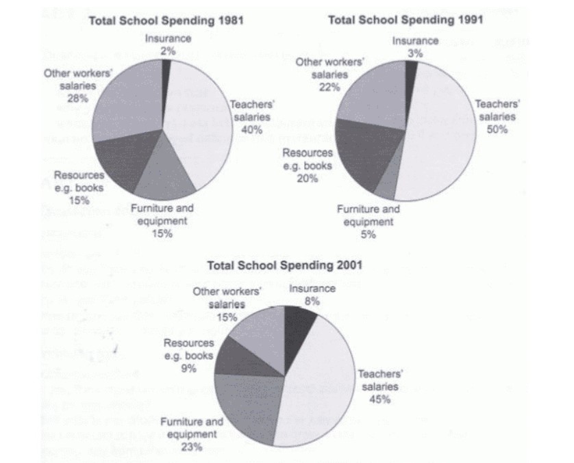
The pie charts compare the expenditure of a school in the UK in three different years over a 20- year period. Summarize the information by selecting and reporting the main features, and make comparisons where relevant.
The three pie charts illustrate a comparison of the percentage of money spent on the school in the UK in the years 1981,1991 and 2001.
Overall, it can be said that the more money was spent on salaries of teachers in all three different years, while less amount spent on insurance in school in all three different years. The expenditure of others workers salaries fluctuated. However, the salaries of teachers increased slightly over the given period.
Getting back to the details, in 1981, the school spent money on insurance was 2%, which increased slightly;y over the given period. In 2001, the money spent on insurance was 8%. In the case of teachers’ salaries, in 1981 , the percentage was 40 percent, which increased slowly , and in 2001, the percentage was 50% of school expenditure. However, in terms of workers’ salaries decreased minimally in 1991 from 28% in 1981 to 22% in 1981, but in 2001, which was 15%.
Moving ahead, the expenditure of a school on resources such as books accounted for 15% in 1981. There was a slight rise in 1991, which was 20%. In contrast, in terms of furniture and equipment were made up 15% in 1981, which declined sharply in 1991. In 2001, with regards to furniture and equipment, 23% of the money was spent by the school, whereas turning to resources, 9 per cent of the money was utilized by an educational institute.
Follow Us on IELTSFever Facebook
