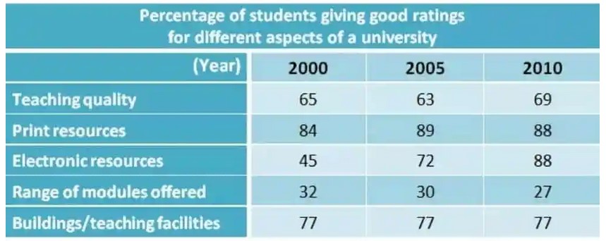
The table below shows the results of surveys in 2000, 2005 and 2010 about one university. Summarise the information by selecting and reporting the main features, and make comparisons where relevant.
The following graph depicts the outcome of studies conducted in three different years regarding specific campuses. Based on students’ satisfaction, there are varying degrees of results trend in five specific segments during those three years.
Regarding teaching quality, the trend fluctuated over the years. The year 2010 showed the best result, with 69% of the pupils showing a good perceived rating regarding the quality of teaching. Moving on to print resources, the segment steadily scored over 80% of the percentage in every year of surveys. Another positive result can be seen in electronic resources. The aspect became the most-improved one with 88% result in 2010 almost doubled the initial score in 2000.
The most concerning aspect of the university based on the research is the range of modules offered. During three year studies, the aspect could only get just a third of the total percentage regarding the pupils’ satisfaction. While there are results that are fluctuated, improved, or declined, there was also a single segment that went nowhere in these three years of studies. Building/teaching facilities stayed at 77% during all periods of surveys.
Follow Us on IELTSFever Facebook
