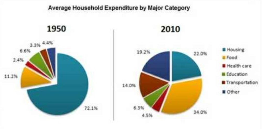
The pie charts below show the average household expenditures in a country in 1950 and 2010. Summarise the information by selecting and reporting the main features, and make comparisons where relevant.
Sample Answer of Average Household Expenditures in a Country in 1950 and 2010
The given pie charts delineate the proportion of household expenditures of the 6 sectors in the country in the years 1950 and 2010. Overall, housing was the major expenditure in 1950, which drastically diminished after 60 years of time whereas food became more household expenditure than housing. A72.1 percent of the money spent on housing in 1950, which was almost sevenfold larger than food, stood at 11.2%. The education was witnessed as 6.6%, exactly twofold increase than transportation, which was 3.3%in 1950. Transportation and others have contributed a trivial percentage as 2.4 and 4.4 percent respectively.
After the 60 consecutive years, the household expenditure significantly changed and further the food developed as the most costlier item which at 34%followed by housing at 22%. Another major change was noticed in others where it surged around 5 times to 19.2% from 4.4 percent in 1950. The transportation and education experienced slight hike as 14%and 4.5%. On the contrary, a 3% decrease has seen in education which plummeted from 6.6% in 1950 to 6.3% in 2010.3k.
Follow Us on Facebook
Also, Read A Beachfront Area in Australia Between 1950 and Today
