The graph shows the percentage of the population living in urban areas on different continents. Summarise the information by selecting and reporting the main features, making comparisons where relevant.
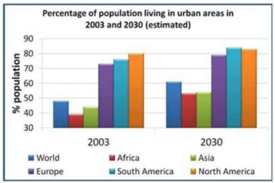
The bar graph depicts the ratio of populace residing in cities in diverse mainlands after twenty-seven years.
In 2003 ratio of people who were living in Africa was 40 per cent, which increased by almost 12 per cent, which was equal to Asia’s ratio in 2030. at the same time, the ratio of the World population surged more than 12 per cent.
The ratio of people who live in North America is inclined by negligence difference which was around 81 per cent after almost two and half-decade. On the other side, the ratio of European natives was nearly 72 per cent in 2003 which later increased by only 6 per cent. Whereas, a slight surge has been observed in the ratio of dwellers who were residing in South America.
Overall, In every continent ratio of the population was increased. There was no decrease has been noticed in the ratio of humans on any mainland. The maximum difference has been seen in the ratio of natives who were kept there in the World.
Follow Us on IELTSFever Facebook
Also read: The Graph Below Shows the Average Monthly Use of Health Clubs in Miami and Florida