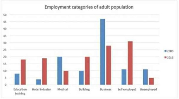
The chart shows the employment status of adults in the US in 2003 and 2013. Summarise the information by selecting and reporting the main features, making comparisons where relevant.
The line chart gives information about the professional status of adults in the United States from 2003 to 2013. Overall, most of the adults in the US preferred to do business in the year 2003, while in the year 2013, adults of the US like to be self-employed.
To begin with, Education training and Hotel Industry shows around 7 and 5 respectively in 2003, after a span of 10 years employment of adults population increases up to 20. On the other hand, Medical and Building Industry depicts an increase of adult population from 20 in 2003 and 10 in 2003 respectively, while the similar opposite trend is shown over a period of 10 years which accounted for 10 and 20 adult population.
Business Industry is leading among all other categories with an employment rate of around 45 in the year 2003 and then sudden decrease to approximately 27 in 2013, while self-employed category shows an increase of around 20 adult population over a period of 10 years.
Few of the US Population is unemployed, which accounted for around 1o in the year 2013 and then a decrease to 5 adult populations.
Follow Us on IELTSFever Facebook
Also read: The Graph Below Shows the Average Monthly Use of Health Clubs in Miami and Florida
