The graph below gives information about changes in the birth and death rates in New Zealand between 1901 and 2001. Summarise the information by selecting and reporting the main features, and make comparisons where relevant.
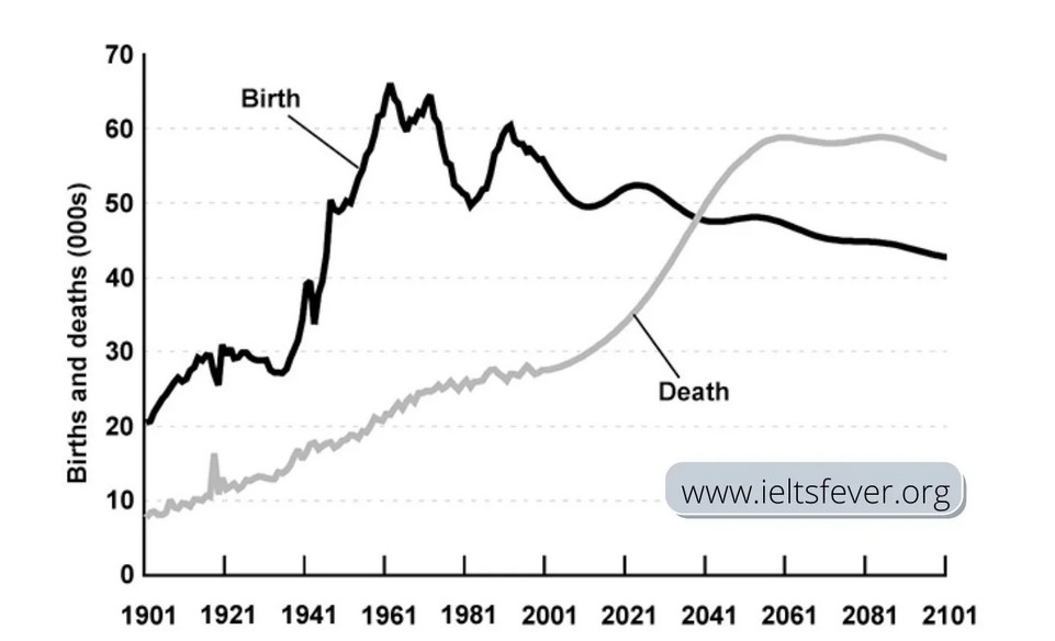
The line chart illustrates the ratio of birth and death in New Zealand over a period of two centuries.
From an overall perspective, the birth rate of New Zealand people showed a dramatic increase from 1901 to 1981. On the other hand, the figure of deaths inclined gradually form over a period of time and it will surpass the birth rate that is predicted.
At first glance, it can be seen from the chart, the rate of birth initially stood at 20,000 in 1981, then slowly increases till 1941 with some fluctuations. In 1941, it was about little less than 30,000, then it went up sharply till 1961, and reached a peak of around 65,000. However, it again declined dramatically at 50,000 in 1981, but it experienced a rise of 60,000 between 1961and 2001. Afterwards, it decreased to 50,000 in 2001. Regarding the death rate, it was stood at less than 10,000 in1901, then experienced a slow rise till 2001 about 28,000.
Moving on further, it is expected that by 2021, the death rate will be reached at almost 33,000, then it will cross the rate of birth in 2041 at 48,000. Subsequently, it will rise up to 58,000 and will be remained constant till 2101. In terms of the ratio of birth, it is forecasted that it will be decreased in 2041 at 50,000 and will be experienced a decline till the end of the period, at almost 43,000 in 2101.
Follow Us on IELTSFever Facebook