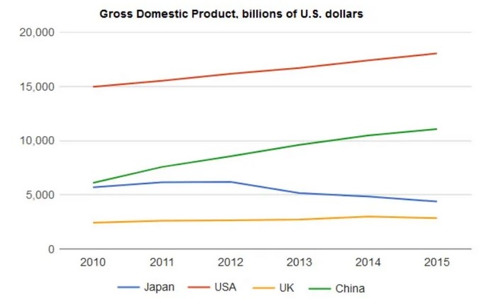
The graph below shows the Gross Domestic Products (GDP) in four selected countries between 2010 and 2015. Summarize the information by selecting and reporting the main features, and make comparisons where relevant.
 Sample Answer of The Graph Below Shows the Gross Domestic Products (gdp) in Four Selected Countries Between 2010 and 2015
The graph illustrates the gross domestic product(GDP) of specified countries (USA, China, Japan and the UK)from three different continents, in a 5-year period between 2010 to 2015.
Overall, the Gross domestic product of the USA and China witnessed an increase throughout the period, whereas that of Japan slightly decreased during the time frame. Furthermore, the gross domestic product for the UK remained constant from start to finish.
The gross domestic product for China and USA in 2010 stood at around 6,000billion dollars and 15,000billion dollars, respectively. These figures steadily rose with both countries experiencing peak points at the end of the period and doubled as the highest of the chosen countries.
On the other hand, compared to USA and China, Japan’s GDP was considerably lower. Although it was only a little worse than China’s at the initial point, it achieved very little growth until 2012 where it saw an increase of close to a 1000billion dollars. Subsequently, it began to fall slightly in the following year and continued to do so in the last two years, gradually hitting a lowest of around 4500billion dollars. UK’s Gross domestic product, however, remained stable at approximately a 2500billion dollars from beginning to end with no fluctuations whatsoever.
Follow Us on IELTSFever Facebook